11 Presentation Tips Guaranteed to Strengthen Your Pitch
Thursday, April 28, 2016
Marketing
11 Presentation Tips Guaranteed to Strengthen Your Pitch
As I sat in Astronomy 101 staring at the slides prepared by my professor, my eyes began to water. I enjoyed the subject, and my professor was a genius (literally, he controlled the arms that released the Hubble telescope into space). I wanted to absorb everything on those lecture slides.
But I was in physical pain. My eyes were burning.
Each slide was bright blue with bright yellow copy. And it went on forever. Bullet after bullet, slide after slide – with some images thrown in randomly.
I couldn’t help but wonder: If the presentation had been designed and structured differently, would my classmates and I have focused more easily?
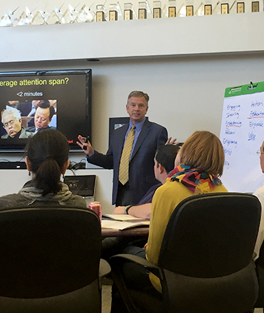
Recently, Tim Wackel visited our office to conduct a workshop about great presentations. As one of the most engaging speakers I’ve ever seen, he proved he knows what he’s talking about.
And he gave us permission to share his secret sauce for structuring a presentation.
How to Structure a Presentation
 Open with a hook. Something wacky or thought provoking. Tell a funny story, or open with a sobering statistic related to your presentation. Provoke a laugh or a gasp – or even a raised eyebrow.
- Outline your objective. Tell them what you want them to do and why they should care – one part call-to-action, one part benefit. For instance, “Buy my product and it will save you $500k per year.”
- Prove you can follow through. Use stats and testimonials, or reveal your secret sauce, to show how you can deliver on the promise you just made. But keep it short and simple; organize the information into three succinct sections.
- Ask for a commitment. End by asking, “What is keeping you from committing right now?” This pushes them to reveal specific doubts (make sure you prepare to address those) and encourages them to sign that contract or write that check.
Tim also says there are three key elements that determine the effectiveness of a presentation: verbal, vocal and visual. Visual has the most influence by far, at 55 percent, followed by vocal at 38 percent and verbal with a mere 7 percent.
Tim can offer great insight into voice and body language, but I’m going to give you a graphic designer’s tips on improving the slides themselves.
Presentation Design Tips
- Know the environment. Will you be using a TV or projector? Is your audience close or far away? Will you be able to stand in front of the room? Can you dim the lights? Consider all these things before laying out your deck.
- Keep it simple. YOU are the presentation. Your slides are only a guide. So pare the information down to the highlights – just remember, people can’t read 20 lines of copy on a single slide, much less digest them, so spread out the information! It doesn’t cost you anything to add another slide – it’s digital.
- Stick to two fonts. And don’t try to be cute or cliché with your font choices – make sure they are legible from far away.
- Use color intentionally. Use color to differentiate sections or call out important information. Avoid the brightest colors in the toolbox; they often become too vibrant when projected or on a screen.
- Pacing. Pacing. Pacing. You set the tone with pacing, and your slides set your pacing. Use images or blank slides as a pause or to transition to a new idea.
- Use clear imagery. DO NOT stretch your images. (Pro tip: When you resize images by clicking and dragging from the corner, hold the shift key to retain the correct proportion and prevent that warped look.) If it needs to be smaller or a certain size, use the crop tool.
- Make data visual. When possible, use graphics like pie charts to illustrate numbers and percentages.
I can’t say I would’ve gone to work for NASA if my professor had made better presentations, but I can say my eyes would’ve thanked him.
So to keep your audience engaged during your next presentation – instead of overwhelmed by excessive data or distracted by clashing colors – keep these simple rules on hand.
But wait: How do you overcome a paralyzing fear of public speaking? What if eye contact distracts you? What if a comment from the audience throws a wrench into your presentation? Tim can help. We highly recommend you hire him to talk to your organization.
Tags: Consulting & Training