Go for the Eyes: 10 Ways to Boost Web Traffic with Visual Content
Tuesday, April 8, 2014
by Stephanie Orges
Marketing
Go for the Eyes: 10 Ways to Boost Web Traffic with Visual Content
Text content is all well and good – but how will anyone pin your brilliant article on Pinterest if there’s no image? What’s a mere text link going to look like in a Facebook stream? Snore.
Missing out on social shares means missing out on oodles of blog and web traffic, so don’t let your words go out naked. Here are 10 types of visual content to dress up your tweets, Facebook posts, blog posts, whitepapers and more.

1. Your Own Photos
How to use: standalone on most platforms; paired with blogs, whitepapers
You’ve got a smart phone. Use it. Take slice-of-life photos of your coworkers, building, customers (with permission) – any person, object or setting relevant to your content. Here are some tips on taking good photos.

Image by Nan Palmero
2. Creative Commons Photos
How to use: paired with blogs or whitepapers
If you can’t take your own photos, don’t despair! There are thousands of free photos available on sites like Flickr and Stock.XCHNG . Remember: only use photos that have a Creative Commons – Attribution license (meaning you’re allowed to use the image as long as you link back to the creator).

3. Author Photos
How to use: paired with blogs or whitepapers
It’s good to put a face with a name. Consider including an author photo and possibly a short bio with each blog post. B savvy: if you activate Google Authorship, Google will automatically put the profile photo next to your content in search results.
4. Pull Quotes
How to use: paired with blogs or whitepapers
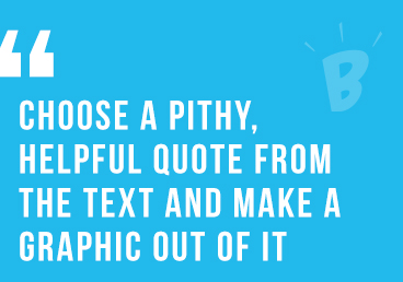
An easy way to make long content more shareable: choose a pithy, helpful quote from the text and make a graphic out of it (use one of your brand fonts), then insert the graphic near the text version of the quote, in a magazine-style callout.

5. Cartoons
How to use: standalone on most platforms; paired with blogs or whitepapers
Who doesn’t love a cartoon? There are several ways to get them:
- Look for free cartoons online (check for the Creative Commons license).
- Pay to use a cartoon through a site like CartoonStock.com
- Draw your own – depending on your brand personality, even stick figures could suffice. Popular sites such as Wait But Why and Hyperbole and a Half have used rudimentary sketches very successfully.

6. Memes
How to use: standalone on most platforms; paired with blogs or whitepapers
Memes are running web jokes people copy and reinterpret. Done right, they can earn laughs and lots of shares. Check KnowYourMeme.com for popular memes and DIY templates. Just avoid anything marked “NSFW” (not safe for work).

7. Animated GIFs
How to use: standalone on most platforms; paired with blogs or whitepapers
Add motion to your image without going full-on video with an animated GIF. Just a few frames can help tell a story, express an emotion, or demonstrate some instructions.
8. Videos
How to use: standalone on most platforms; paired with blogs or whitepapers
Videos are great for showing how-tos or for demonstrating products in fun ways. Micro-video platforms like Vine and Instagram can be great for quick tips. Shoot and edit your own videos or hire a professional (hint hint) to do it for you.
9. Infographics
How to use: standalone on most platforms; paired with blogs or whitepapers
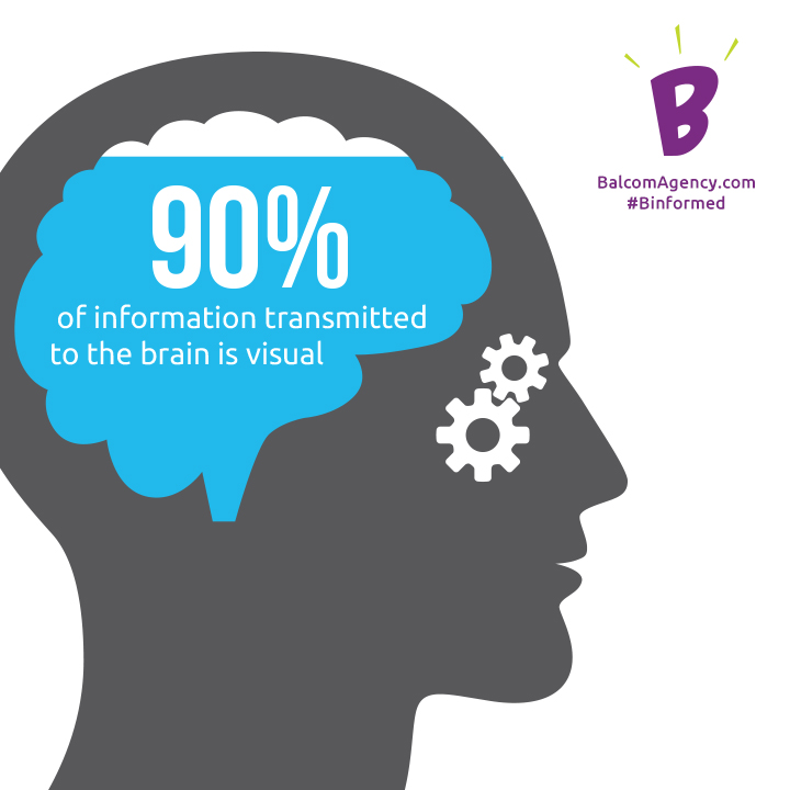
Organize large amounts of information into an illustration that’s easy to digest and super shareable. While you can try your hand at creating your own simple graphics using online tools, it’s best to hire a professional to design complex infographics.
10. Formatting
How to use: paired with blogs or whitepapers
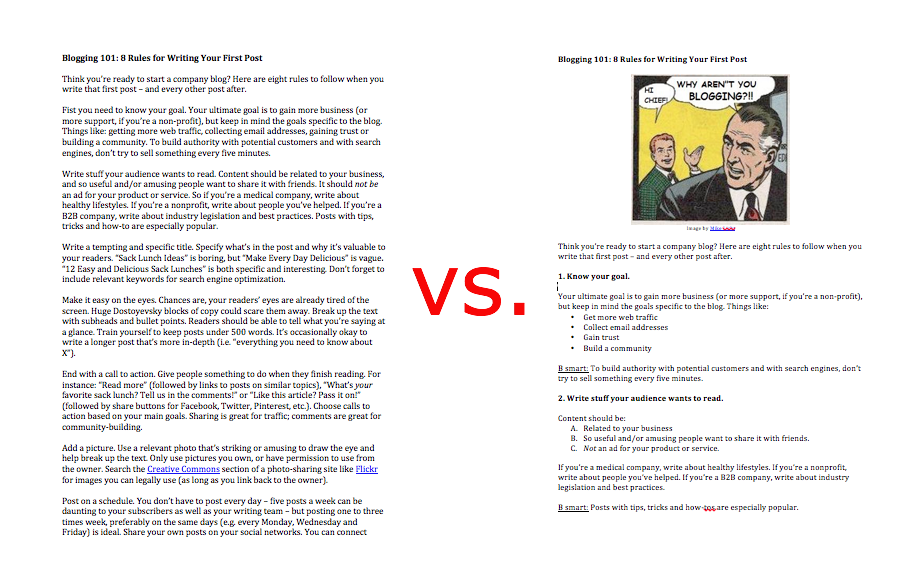
Adding images isn’t the only way to make text content more visual – you should also format the text itself, using headers, subheads and bullet points to:
- Create white space where the eye can rest.
- Organize your ideas in a visual hierarchy, making it easier for your readers to understand what you’re saying – faster.
B Savvy: Dress Up Your Real-World Content, Too
Imagery is as relevant in the real world as online. Ads, brochures, point of sale (and your website, come to think of it) all require a more professionally-designed look – above the DIY flare typical of social media – but many of these tips still apply. Use your own (professionally shot) photography or buy stock photography. Pull quotes and infographics work beautifully in print, and formatting is a must. You could even try a meme or a cartoon if it suits your brand.
Sure, it may take a little extra effort to make your content more appealing to the eye – but it’s overwhelmingly worth it. Here are the stats to prove it.